Back Cartograma Catalan Anamorfóza (kartografie) Czech Kartenanamorphote German Cartograma Spanish Pindalakaart Estonian کارتوگرام Persian Kartogrammi Finnish Cartogramme French Cartograma Galician קרטוגרמה HE

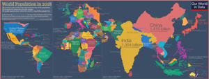
A cartogram (also called a value-area map or an anamorphic map, the latter common among German-speakers) is a thematic map of a set of features (countries, provinces, etc.), in which their geographic size is altered to be directly proportional to a selected variable, such as travel time, population, or Gross National Product. Geographic space itself is thus warped, sometimes extremely, in order to visualize the distribution of the variable. It is one of the most abstract types of map; in fact, some forms may more properly be called diagrams. They are primarily used to display emphasis and for analysis as nomographs.[1]
Cartograms leverage the fact that size is the most intuitive visual variable for representing a total amount.[2] In this, it is a strategy that is similar to proportional symbol maps, which scale point features, and many flow maps, which scale the weight of linear features. However, these two techniques only scale the map symbol, not space itself; a map that stretches the length of linear features is considered a linear cartogram (although additional flow map techniques may be added). Once constructed, cartograms are often used as a base for other thematic mapping techniques to visualize additional variables, such as choropleth mapping.
- ^ Tobler, Waldo (March 2022). "Thirty-Five Years of Computer Cartograms". Annals of the Association of American Geographers. 94 (1): 58–73. CiteSeerX 10.1.1.551.7290. doi:10.1111/j.1467-8306.2004.09401004.x. JSTOR 3694068. S2CID 129840496.
- ^ Jacque Bertin, Sémiologie Graphique. Les diagrammes, les réseaux, les cartes. With Marc Barbut [et al.]. Paris : Gauthier-Villars. Semiology of Graphics, English Edition, Translation by William J. Berg, University of Wisconsin Press, 1983.)
© MMXXIII Rich X Search. We shall prevail. All rights reserved. Rich X Search