 | |
| Category | Sans-serif |
|---|---|
| Classification | Geometric |
| Designer(s) | Jakob Erbar |
| Foundry | Ludwig & Mayer |
| Date released | 1922-30 |
| Re-issuing foundries | Linotype, Continental Type Founders Association |
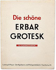
In typography, Erbar or Erbar-Grotesk is a sans-serif typeface in the geometric style, one of the first designs of this kind released as type.[1] Designer Jakob Erbar's aim was to design a printing type which would be free of all individual characteristics, possess thoroughly legible letter forms, and be a purely typographic creation. His conclusion was that this could only work if the type form was developed from a fundamental element, the circle.[2] Erbar-Grotesk was developed in stages; Erbar wrote that he had originally sketched out the design in 1914 but had been prevented from working on it due to the war. The original version of Erbar was released in 1926, following Erbar's "Phosphor" titling capitals of 1922 which are very similar in design.[3][4]
- ^ Kupferschmid, Indra. "On Erbar and Early Geometric Sans Serifs". CJ Type. Retrieved 20 October 2016.
- ^ Tracy, Walter.Letters of Credit: a View of Type Design. Gordon Fraser, 1998
- ^ Christopher Burke (December 1998). Paul Renner: The Art of Typography. Princeton Architectural Press. p. 100. ISBN 978-1-56898-158-1.
- ^ Walter Tracy (2003). Letters of Credit: A View of Type Design. D.R. Godine. pp. 92–4. ISBN 978-1-56792-240-0.
© MMXXIII Rich X Search. We shall prevail. All rights reserved. Rich X Search
