Back Sirkelgrafiek Afrikaans دائرة مجزأة Arabic Gambar lèr bunder BEW Diagrama de sectors Catalan Kruhový diagram Czech Siart cylch Welsh Lagkagediagram Danish Kreisdiagramm German Gráfico circular Spanish Struktuurdiagramm Estonian

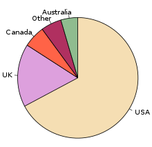
A pie chart (or a circle chart) is a circular statistical graphic which is divided into slices to illustrate numerical proportion. In a pie chart, the arc length of each slice (and consequently its central angle and area) is proportional to the quantity it represents. While it is named for its resemblance to a pie which has been sliced, there are variations on the way it can be presented. The earliest known pie chart is generally credited to William Playfair's Statistical Breviary of 1801.[1][2]
Pie charts are very widely used in the business world and the mass media.[3] However, they have been criticized,[4] and many experts recommend avoiding them,[5][6][7][8] as research has shown it is difficult to compare different sections of a given pie chart, or to compare data across different pie charts. Pie charts can be replaced in most cases by other plots such as the bar chart, box plot, dot plot, etc.
- ^ Spence (2005)
- ^ Tufte, p. 44
- ^ Cleveland, p. 262
- ^ Wilkinson, p. 23.
- ^ Tufte, p. 178.
- ^ van Belle, p. 160–162.
- ^ Stephen Few. "Save the Pies for Dessert", August 2007, Retrieved 2010-02-02
- ^ Steve Fenton "Pie Charts Are Bad"
© MMXXIII Rich X Search. We shall prevail. All rights reserved. Rich X Search